Register for my upcoming The Marketing Engineer: Vibe Coding for Marketers course on Maven
Turn written content into polished infographics in minutes, no design skills needed
Natalie Lambert
6/23/20252 min read


Welcome to Prompt, Tinker, Innovate—your weekly AI playground. Every edition delivers a practical prompt you can try right now. No theory, no fluff—just AI that actually works.
This week’s playground: Create infographics from blogs—without a design team
Why this matters
You’ve got great content. But turning it into something visual? That used to mean wrangling a designer or firing up Canva. Now, you can do it in minutes—just by pasting a URL (or uploading a document).
Infographics aren’t just prettier—they’re more effective. They boost engagement, simplify complexity, and give your content a second life on social, in decks, and on your website.
If you’re a solo founder, marketer, educator, or content creator, this turns your words into visuals—no waiting, no design bottlenecks.
AI-generated infographics: A bake-off
To see if AI could truly replace a designer or at least eliminate the drag-and-drop grind of design tools, I ran a simple test: the same prompt across three major chatbots and their various models. The results? Wildly inconsistent.
Here’s the TL;DR:
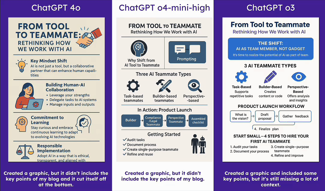
ChatGPT (all models): Total miss. I didn’t like anything it produced. This is not the tool for visual content like infographics.
Claude with Artifacts: Surprisingly good—but only when using the Artifacts feature (you’ll need to enable this in the Integrations tab under Settings). Unlike ChatGPT, Claude actually builds the infographic in code, essentially creating a webpage. You can easily convert this into an image or PDF, but what really impressed me was how editable it is. You can prompt Claude to tweak it or make direct changes to the HTML.
Gemini with Canvas vs. Deep Research: Canvas did well, but the real standout was Gemini’s native infographic generation inside its Deep Research tool (which I previewed here). Like Claude, Gemini builds the infographic in editable code, but because this step follows a full Deep Research analysis, the depth and structure of the resulting infographic was far superior.
Your AI experiment: Try this prompt
Using Gemini:
👉 Time to tinker: Open Gemini, select “Deep Research” in the input box, and use the prompt below. 📝 Prompt: “Please you turn the content of this blog into an infographic: [Insert blog URL here]”
Gemini will take its time analyzing your content. If your results look like mine, you’ll get a white paper–style breakdown based on your blog. Once it finishes, click the “Create” button in the top-right and choose “Infographic.”
💡 Random aside: Notice the other options when you click “Create”? You can also generate a webpage or an audio overview. Totally worth a try. You won’t be disappointed.
Using Claude:
👉 Time to tinker: Drop this prompt into Claude.
📝 Prompt: “Using artifacts, please turn the content of this blog into an infographic: [Insert blog URL here]”
💡 Pro tip: Customize it to match your brand with follow-ups like:
“Use #4c26a0, #00a3a1, #ffc300—our brand colors.”
“Make headers and body text Inter”
“Edit the text in the third section to say this: [Insert your text]”
What can you turn visual?
Got a blog, newsletter, webinar transcript, white paper, case study, or something else? Run it through this prompt. Then send me your best infographic—I might feature it in a future edition.
📩 See you next week with another test-worthy AI prompt. Want more experiments? Hit ‘subscribe’ at the top.